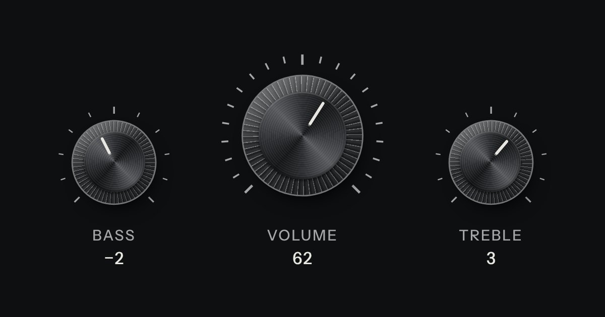
Knob
A rotary control for continuous or stepped values where space is square. Its knurl and pointer turn; its light does not.
Kit parts
A continuous value along a line: a native range whose cap rides in a slot cut into the plate, with a printed scale.
Seats open in 11 days. Want one email that morning?
A native range with its track and thumb styled through the WebKit and Mozilla pseudo-elements. The slot is the well fill with a short inset shadow. The scale is two repeating gradients.
| Name | Kind | Description |
|---|---|---|
| data-material | attribute | What the cap and its printed line are made of, apart from the page’s finish. The slot and the scale are the plate’s and keep the finish. On the fader or on its device. Anodised blue and green go on a whole device only. |
| min · max · step · value | attribute | Native. Make the step what the value can really be. |
| input · change | event | Native: input while moving, change on release. |
| Arrows · PageUp/PageDown · Home/End | keyboard | Native range behaviour. |
Drag a cap, or focus it and use the arrow keys, Page Up/Down, Home and End.
A rotary control for continuous or stepped values where space is square. Its knurl and pointer turn; its light does not.
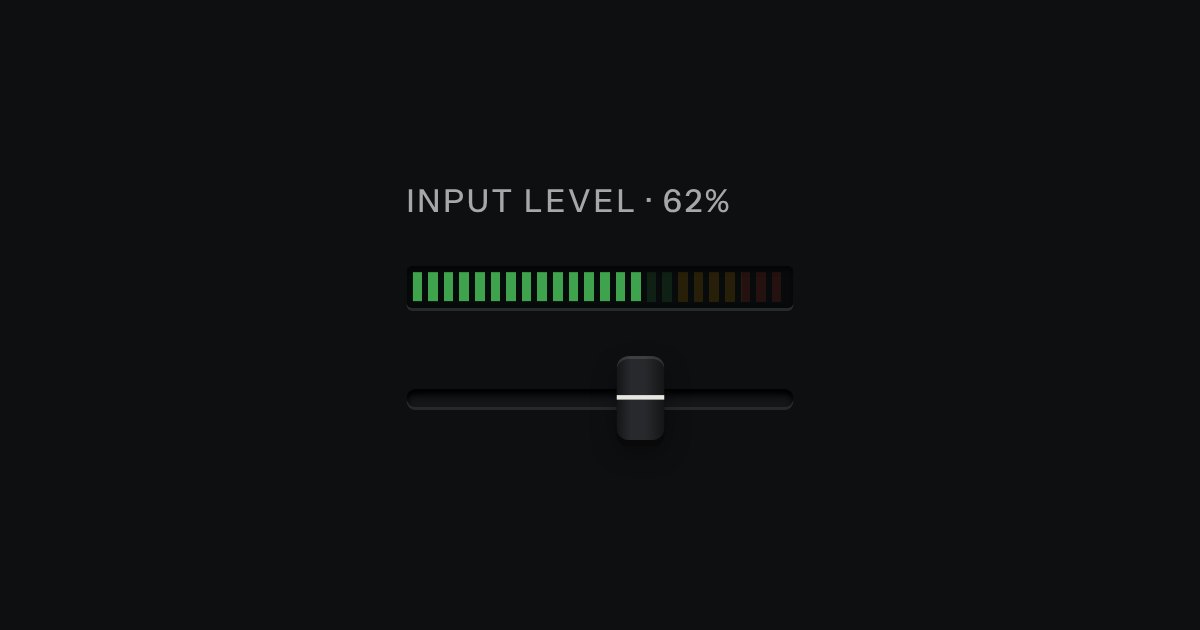
An LED ladder for levels and load: green, then amber, then red, the way a recording level has always been read.
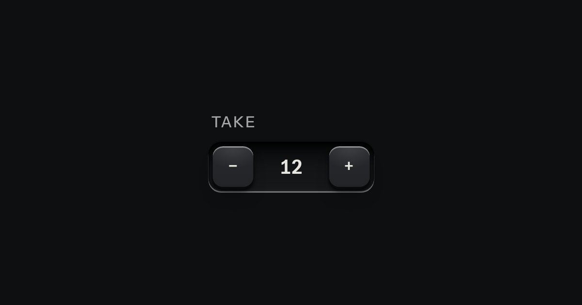
A small integer with − and + keys either side, in one well.