Key
Every button, and every link that acts like one: a cap on a skirt that drops below the plate when pressed.
Kit part · Tooltips
A few words on a small label plate, the kind riveted beside a control on a rack: printed in the contrast colours with a rule just inside its edge and a short tab aimed at its key. It comes up when a pointer rests on the key or the keyboard reaches it, is read by a screen reader, and goes on Escape.
Seats open in 11 days. Want one email that morning?
Both finishes, side by side. Hover, pressed and focus are forced with .is-hover, .is-down and .is-focus; checked and disabled are real.
Aluminium
| Part | Rest | Pointer resting | Keyboard focus | After Escape | At the top edge |
|---|---|---|---|---|---|
| Tip |
Graphite
| Part | Rest | Pointer resting | Keyboard focus | After Escape | At the top edge |
|---|---|---|---|---|---|
| Tip |
| Name | Kind | Values | What it does |
|---|---|---|---|
| data-tip | attribute | text | The words. Upgraded to a plate with role="tooltip" when the script loads; drawn from CSS until then. |
| data-tip-side | attribute | top · bottom · left · right | Where it prefers to hang (top). It flips to the other side, or slides along, to stay on screen. |
| data-tip-kbd | attribute | Mod+K | A shortcut printed after the words, ⌘ on a Mac and Ctrl elsewhere, and set as aria-keyshortcuts on the key. |
| data-tooltip | attribute | id | Use a .tui-tooltip written in the page instead of the words of data-tip. |
| aria-describedby · aria-labelledby | set by the script | the plate’s id | Described by the plate; a trigger with no name of its own is named by it instead. Ids already there are kept. |
| .tui-tooltip | class | role="tooltip" | The plate. data-placed says the side it took; data-static draws one in the page. |
| Escape | key | while one is out | Puts it away and does nothing else, so a dialog behind it stays open. It stays away until the key is left. |
| TIP_HOVER_MS · TIP_FOCUS_MS | constant | 400 · 120 | The rest before it shows for a pointer, and for focus. Once one has been out, the next shows at once. |
| tooltipPlacement · tooltipHTML · keyShortcuts | function | kit.mjs | The placement arithmetic, the plate’s inside as markup, and the aria-keyshortcuts value. Pure. |
<button class="tui-key tui-key--icon" aria-label="Play" data-tip="Play">
  <svg …></svg>
</button>

<!-- A shortcut, printed after the words and set as aria-keyshortcuts -->
<button class="tui-key tui-key--icon" aria-label="Search the reel"
        data-tip="Search the reel" data-tip-kbd="Mod+K">…</button>

<!-- Another side: top (default), bottom, left, right -->
<button class="tui-key tui-key--icon" aria-label="Power" data-tip="Power" data-tip-side="right">…</button>

<!-- Your own plate, written in the page -->
<button class="tui-key" data-tooltip="tip-archive">Archive</button>
<div class="tui-tooltip" id="tip-archive">Moves it out of the inbox</div>
import '/kit/kit.mjs'; // or just '/kit/parts/tooltip.mjs'
// Every [data-tip] is upgraded on import, and any added later. Change the words
// at any time; the plate and what a screen reader hears follow.
key.dataset.tip = playing ? 'Pause' : 'Play';Needs kit.css and kit.mjs. How to install the kit.
role="tooltip", and the key points at it with aria-describedby, so a screen reader reads the words after the key’s name. A key with no name at all is named by the plate.aria-label. The shortcut’s symbols are named for a screen reader: “Control K”.The script makes one small plate per key at the end of the page, a manual popover, so it is drawn in the top layer above any card or scrolling box and never clipped. It is placed by the popover part’s arithmetic with a 6px corner and an 8px gap, then its tab is aimed at the key’s centre. The plate is the contrast cap’s colours with an outline set 3px inside its edge, printed, not raised; in Quiet its shadow is the volume’s hairline, on paper it is flat and in the mono face. Without the script the same plate is drawn from data-tip with ::after, and stands down once the script has the key.
Name an icon key in a word or two, for the eye and the ear alike, and get out of the way the moment it is not wanted.
5 rules in this file, with the foundations they rest on and the anti-patterns that break them. Full rules ship in the brain with the Pass.
Every button, and every link that acts like one: a cap on a skirt that drops below the plate when pressed.
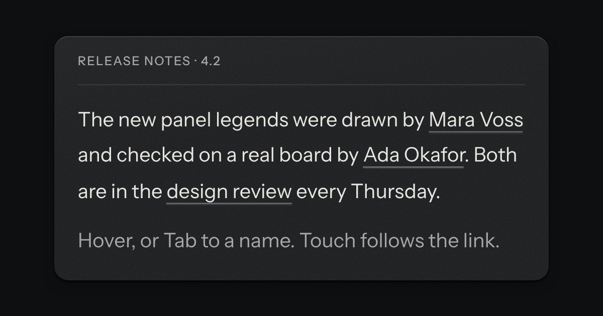
A preview that hangs from a link when the pointer rests on it or the keyboard reaches it. The popover’s card and leader, opened by a short delay and put away by leaving.
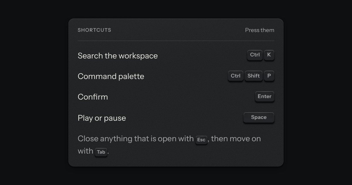
The key to press, drawn as the key: a small cap on a skirt with a dish worked into its top. Shortcuts come as combos and follow the platform, so ⌘ K on a Mac is Ctrl K elsewhere.