Selector
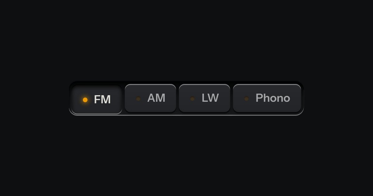
One mode of two to five: latching keys in a tray, one down at a time, each with a lamp that lights when chosen.
Kit parts
Four chunky push buttons in a row, one down at a time, the way a car radio’s station presets work: press one and it plunges in and stays there, its number lit; press another and the first springs back up as the new one takes its place. A native radio group underneath, so it works with no script: Tab stops once on the bank, and the arrow keys move the choice and press a key in the same motion.
No lamp dot and no script.
| Name | Kind | Description |
|---|---|---|
| legend | element | Names the bank for a screen reader (“Sections, radio button, Home, 1 of 4”); printed off-screen. |
| checked | attribute | The latched key: sunk the full skirt, its digit lit in the amber lamp colour. |
| change | event | Native, on the radio that became checked. |
| Arrows | keyboard | Native radio behaviour: arrows move the choice and press it in the same motion. |
| presetBankHTML() | function |
Press a button, or Tab to the bank and use the arrow keys. The chosen one stays sunk in with its number lit; the one it replaces springs back up.
One mode of two to five: latching keys in a tray, one down at a time, each with a lamp that lights when chosen.
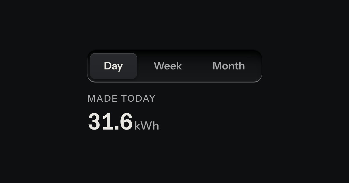
Views of the same thing, switched in place: keys in a tray, the chosen view a raised cap.
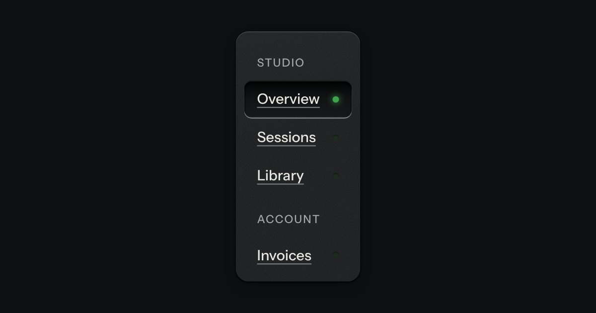
App navigation in a panel: the current page is a recess with its lamp lit, links grouped under printed labels.
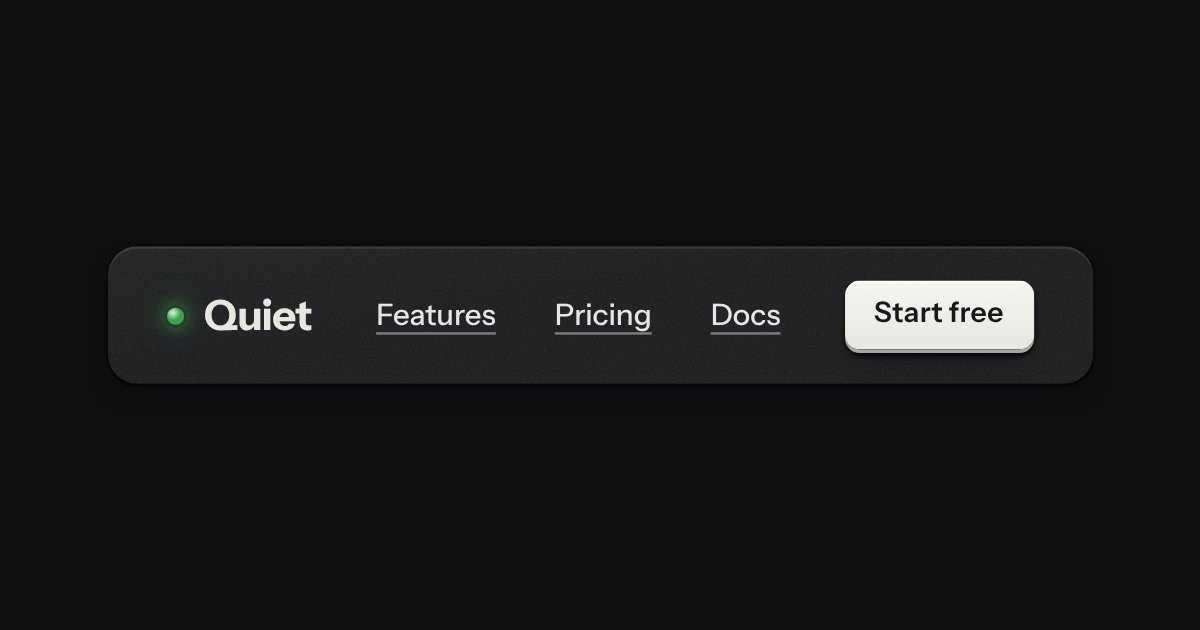
The top of a page: a wordmark with a lamp, printed links, and one contrast key at most.