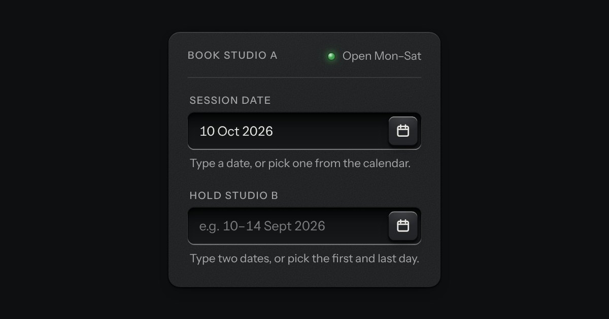
Date picker
A date field with its calendar card in a slot underneath: type a date in any common form for your locale, or press the key and the card slides out. Single dates and ranges; shown the Intl way, posted as ISO.
Kit parts
A date typed in three segments, day, month and year, in the field’s own well. Each segment is a small number you can step with the arrow keys or type over, and typing moves you on by itself once a number is complete. The order and the separator are the reader’s. A calendar key at the right of the well opens the kit’s calendar for anyone who would rather point. The form gets an ISO date, yyyy-mm-dd, or nothing while the date is not complete, and a wrong date says what is wrong in a sentence: February has 28 days in 2026.
Seats open in 11 days. Want one email that morning?
The field’s own well, with the kit’s small icon key and the kit’s calendar behind it in a native popover. The segment you are on is a plate let into the well, its radius the well’s less the gap so the corners sit together; it is drawn from the ink token, so it follows every finish and both volumes. The segments are inputs, not editable text, so the numeric keyboard, autofill rules and form behaviour are the browser’s. Nothing animates.
| Name | Kind | Description |
|---|---|---|
| min · max | attribute | The earliest and latest date. The year segment stops at their years when stepped; a typed date outside them is invalid, with a message, not silently moved. |
| locale | attribute | Sets the order and the separator, read from Intl.DateTimeFormat. Falls back to the nearest lang, then the browser. en-GB is d/m/y, en-US m/d/y, de d.m.y. |
| required · disabled · readonly | attribute | Required makes an empty field invalid. Disabled (also by a disabled fieldset) takes it out of the form and the tab order. Readonly keeps it in the form and lets the segments be read but not changed; the calendar key is dropped. |
| today | attribute | The date an empty segment starts from when stepped, and the day the calendar marks as today. Defaults to the real date; set it for demos and tests. |
| data-no-calendar | attribute | Leaves out the calendar key and the card, for a date the reader knows by heart (a birthday). |
| error | attribute | A message from the server. It shows at once, makes the field invalid (customError) and replaces the hint until it is removed. |
| label | attribute | An aria-label for a field with no visible label of its own (no aria-label or aria-labelledby set). Prefer a printed label. |
| value | property | The date as it posts. Setting it fills the segments without an event. Reset restores the value attribute. |
| input · change | event | Fired each time the ISO value changes, from typing, stepping, pasting or the calendar. |
| open() · close() | method | Open and close the calendar. Alt and Down on a segment opens it too. |
| dateFieldOrder() · dateFieldSeparator() | function | The order of the segments and the separator for a locale. |
| dateFieldDaysIn() · dateFieldBounds() · dateFieldClamp() · dateFieldStep() · dateFieldType() | function | Days in a month, what a segment can be, clamping, one step with its wrapping, and one digit typed with its automatic move. |
| dateFieldParse() · dateFieldFormat() · dateFieldParseText() · dateFieldValidity() | function | ISO in and out, a pasted date, and the validity with its plain message. |
Press the day and type 2 then 3: the number is complete, so you move on to the month. Press the calendar key, or Alt and Down, to pick instead.
A date field with its calendar card in a slot underneath: type a date in any common form for your locale, or press the key and the card slides out. Single dates and ranges; shown the Intl way, posted as ISO.
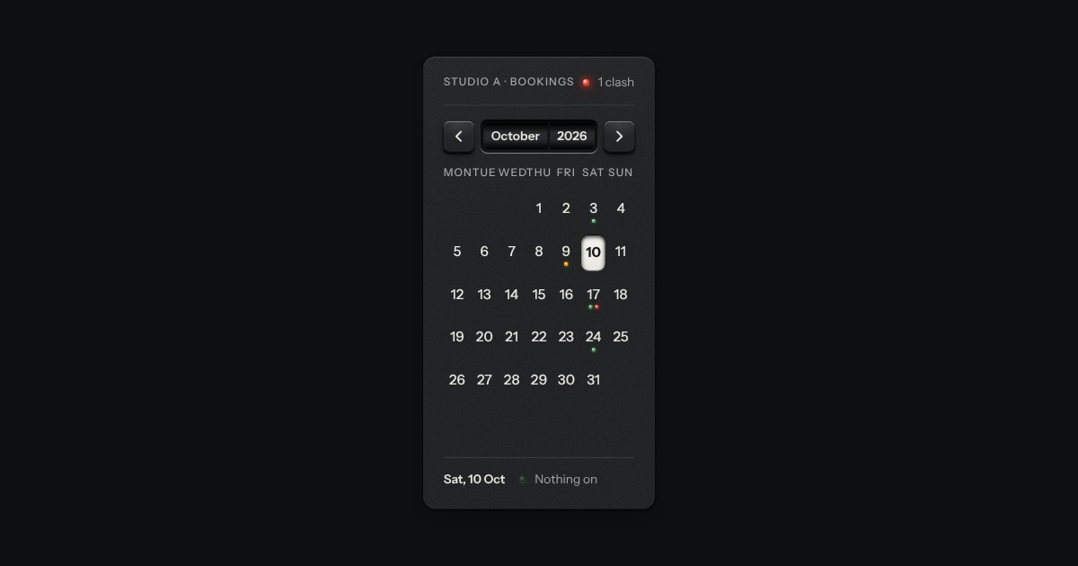
A month on a plate. The month and year sit on two drums behind a window and roll when you page; the chosen day is a latched cap, a range is a groove cut between two caps, and events are lamps named in the line below.
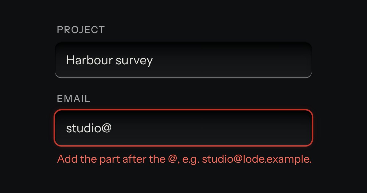
Text entry in a recess, the label printed above it, and a hint that says how to fix an error.
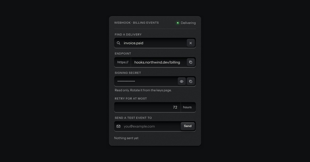
One recess that holds a field and everything that belongs to it. Words that are part of the value but are not typed, such as https:// or a currency, are printed on the floor of the well behind an engraved line; a glyph sits at the start; small keys sit at the end to clear the text, copy it, or show a password.