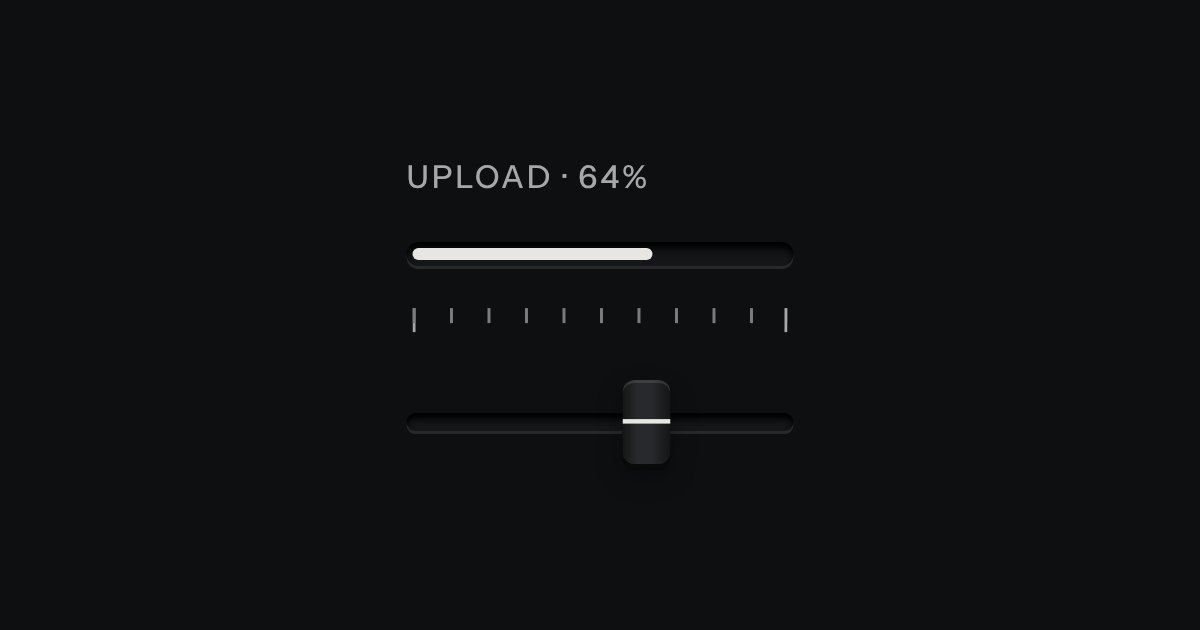
Progress
Progress through a task: ink filling a groove, never a coloured bar.
Kit parts
A darkroom tray. A plate under the tray prints the same words the tongs read out.
One button over a drawn scene, not a bundled photo.
| Name | Kind | Description |
|---|---|---|
| label | attribute | Names the tongs for a screen reader; it stays fixed, since aria-valuetext carries the changing state. |
| value | attribute | How far the print has come up in the developer. Clamped on every change (darkroomClamp()). |
| hung | attribute / property | The print is already on the line, not in the tray; set it up front for a page restoring a finished state, or read it after lift(). |
| disabled | attribute | The tongs stop taking pointer or keyboard input, whatever the value. |
| value | property | |
| lift() | method | Lifts the print now, if it is ready, not disabled and not already hung; fires lift. Returns whether it moved. |
| lift | event | Fires the moment the print leaves the tray, by tongs or by lift(). |
| darkroomTrayHTML(options) | function |
Tab to the tongs.
Progress through a task: ink filling a groove, never a coloured bar.
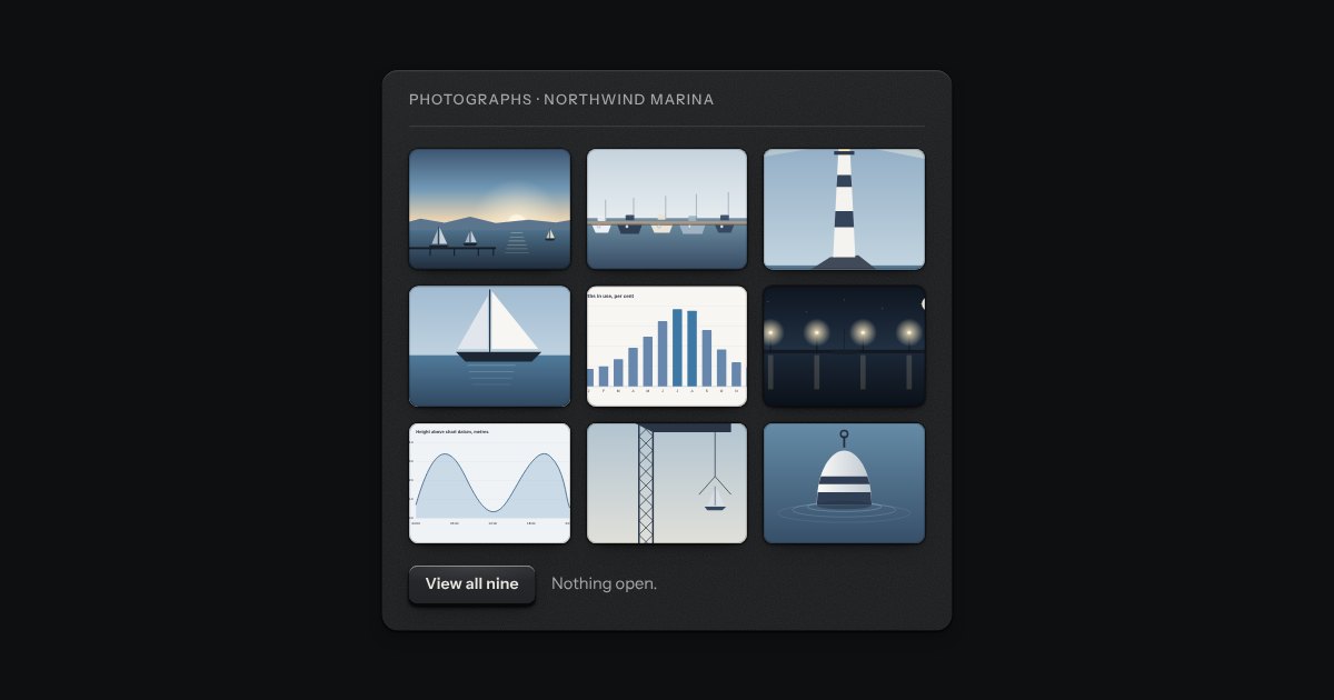
A grid of thumbnails that opens one picture large. Each thumbnail is a plate with the picture set in it, and a real link to the full picture, so the grid works without any script. Press one and the page goes behind a near-black scrim. Left and Right turn the page, Home and End go to the first and the last, Escape puts it away, and on a touch screen a swipe does the same. It is dark in every finish, because a picture is looked at best in a dark room.
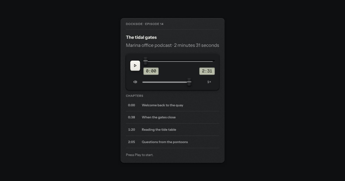
The control bar for an audio or video element. It plays nothing itself: it drives a real media element, so that element’s own events, buffering and errors stay the truth. A primary play key that swaps to pause, the time elapsed and the length on two small LCDs in the mono figures, a scrubber that is the kit’s fader with the loaded length printed as a rule on its floor and the played length filled in, a mute key with a volume fader and an optional speed key. The keys are Space, the arrows and M. For a screen reader the position is a sentence on the scrubber, and a polite status says what happened, no more than once a second.