Field
Text entry in a recess, the label printed above it, and a hint that says how to fix an error.
Kit part · Inputs
A printed label that becomes a field when you press it. At rest it is plain printing, so a page of them reads as text; under the pointer an outline and a pencil say it can be changed. Pressed, it is let into the plate as the field, in the same type, so the words stay where they were. Enter prints the new words back and Escape puts the old ones back.
Seats open in 11 days. Want one email that morning?
Both finishes, side by side. Hover, pressed and focus are forced with .is-hover, .is-down and .is-focus; checked and disabled are real.
Aluminium
| Part | Rest | Hover | Focus | Open | Invalid | Disabled |
|---|---|---|---|---|---|---|
| Label |
Graphite
| Part | Rest | Hover | Focus | Open | Invalid | Disabled |
|---|---|---|---|---|---|---|
| Label |
| Name | Kind | Values | What it does |
|---|---|---|---|
| <tui-inline-edit> | element | with label, and required or empty if wanted | The label and its field. label names the field; required refuses an empty save; empty is the prompt shown when there are no words. |
| button.tui-inline-edit__print | element | holds .tui-inline-edit__text | The printed words, a real button. The script gives it its pencil and a name that includes the words. |
| input.tui-inline-edit__input | element | hidden at first | The real field. It posts with a form whether it is open or not; set its name and value. |
| value | property | string | The words as last saved; setting it reprints them. |
| editing | property | boolean | Whether the field is open. |
| tui-inline-edit | event | detail { value, previous } | Bubbles from the element when new words are saved; change fires from the input as ever. |
| inlineEditResolve(options) | function | { action, previous, draft, required, label } | What an edit comes to: saved, unchanged, cancelled or invalid, with the words said aloud. Pure. |
| Enter · Escape · Tab | key | in the field | Save and close; put the old words back and close; keep what was typed and move on. |
| Enter · Space | key | on the words | Open the field with its text selected. |
<tui-inline-edit label="Project name" required>
  <button class="tui-inline-edit__print" type="button">
    <span class="tui-inline-edit__text">Northwind billing</span>
  </button>
  <input class="tui-inline-edit__input" name="project" value="Northwind billing" hidden>
</tui-inline-edit>

<!-- A value that may be empty: say what shows in its place -->
<tui-inline-edit label="Owner" empty="Add an owner">
  <button class="tui-inline-edit__print" type="button"><span class="tui-inline-edit__text"></span></button>
  <input class="tui-inline-edit__input" name="owner" hidden>
</tui-inline-edit>
import { inlineEditResolve } from '/kit/kit.mjs';
const title = document.querySelector('tui-inline-edit');
title.addEventListener('tui-inline-edit', (e) => {
api.rename(e.detail.value); // saved; e.detail.previous is what it was
});
title.value; // 'Northwind billing'
inlineEditResolve({ action: 'save', previous: 'A', draft: ' B ', label: 'Name' });
// { outcome: 'saved', value: 'B', done: true, say: 'Name saved: B' }Needs kit.css and kit.mjs. How to install the kit.
<button> named by what they say and what they are for, “Northwind billing, edit project name”, so the visible words are the start of the name.The words and the field are the same height and the same type, with the same padding, so opening it moves nothing. At rest there is no cap at all: only the kit’s printing, with a hairline outline and a pencil on hover or focus. Open, the field is the field’s own well. The page keeps one real input for the whole life of the part, hidden when it is not being edited, so it posts, validates and resets like any other. The script is the small decision table in inlineEditResolve and the focus that follows it.
Rename a thing where it is named: press the words, type, press Enter. Escape undoes it, and a screen reader is told what happened.
6 rules in this file, with the foundations they rest on and the anti-patterns that break them. Full rules ship in the brain with the Pass.
Text entry in a recess, the label printed above it, and a hint that says how to fix an error.
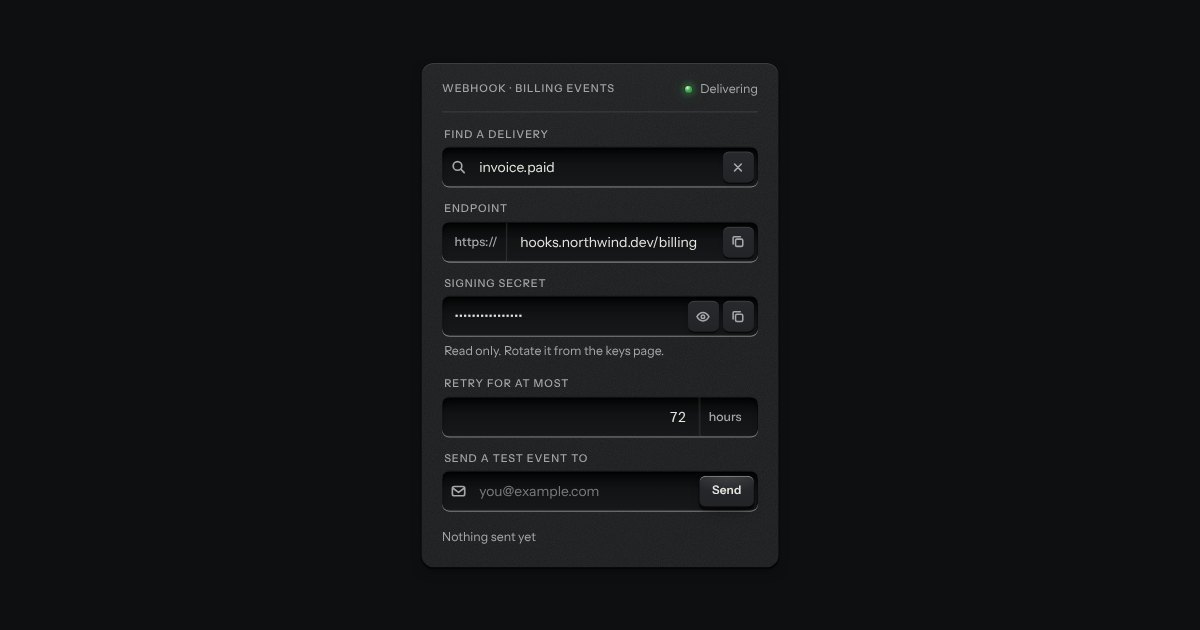
One recess that holds a field and everything that belongs to it. Words that are part of the value but are not typed, such as https:// or a currency, are printed on the floor of the well behind an engraved line; a glyph sits at the start; small keys sit at the end to clear the text, copy it, or show a password.
A number you can type or drag, the way a pro tool’s value field works: an engraved ruler under the numerals slides beneath a fixed index as the value moves.
Longer text in a deeper recess: notes, messages, descriptions. It grows by its corner handle.